Livingetc - Kitchen trends 2024 – 27 sizzling styles, colors, materials and more to watch out for

Written by PIP RICH

Check out all of the 27 sizzling styles, colors, materials and more to watch out for in 2024!

Oversized Handles

'A unique mix of materials and textures for kitchen cabinet knobs are having their moment including leather, Lucite, acrylic, wood and stone,' says Nadia Watts, founder of Nadia Watts Interior Design. 'Integrated pulls are sleek and functional and handleless cabinets are all the rage. Sleek, clean lines still rule with knobs and handles going incognito allowing simplicity to shine and the cabinetry to take center stage. On the flip side of the modern streamlined approach, vintage and antique styles are in, with distressed finishes and unique one of a kind vintage inspired designs.'

AD - 6 Times Designers Modernized Old Furniture—And Why You Should Try It

While still classic, these pieces are no longer stuck in the past. Writen by Michelle Mastro

I love to take existing pieces and create something new! Check out this feature here for all 6 designer’s ideas!

Neoclassical Louis XVI Style Chairs

Painting a piece can totally change the look and feel and open up a wide variety of fabric options. 

Photo: Emily Minton-Redfield

These chairs needed new paint and fabric. Designer and owner Nadia Watts of Nadia Watts Interior Design in Denver had the wood refinished and then painted the frames with a pleasant blueish-gray shade. “We reupholstered the seats and backs with two distinct fabrics and added a braid trim as a welt,” she says. Using two different fabrics created “an element of interest and provided more room for creative expression with color, pattern, and texture,” she says

AD - 11 Living Room Design Ideas Designers Swear By

Breathe new life into old digs Written by Perri Ormont Blumberg

Click HERE for all 11 Design Ideas! I loved being in good company with Noz Nozawa in this article!

MOVE WALL ART

For designer Nadia Watts, art gallery vibes balance otherwise neutral furnishings.

Rotate your art as if you’re in a gallery. You’ll be amazed at the difference a simple tweak can make. Changing the location of your art can dictate a novel approach to transforming the rest of your living room space. Denver-based Nadia Watts of Nadia Watts Design brought in a grouping of artwork from other rooms to curate a new aesthetic by pulling colors from the paintings into the pillows. “This created a new relationship in the room that was not there,” she says.


Swap pillow covers

Swapping pillow covers is a simple way to shift living room design. Nadia Watts likes to “freshen up” a room by changing all the printed throw pillows to bold and solid colors. Color blocking sends a message that the room is polished and no-nonsense. Patterns, on the other hand, create playfulness and exude a certain personality. 

Photos: Emily Minton-Redfield

The Spruce - 5 Things Designers Never Comment On In Other Peoples' Homes

Written by Sarah Lyon Read the full article HERE!

When designers visit other people's homes, what are they really thinking? Are they evaluating the placement of every furniture item and a decorative piece or just sitting back and relaxing? The Spruce wanted to find out so they asked design pros to get the scoop. Read my comments here to find out, some of our answers may surprise you!

Photo courtesy of KRAVET

Business of Home - News Digest Recommended Reading

Thank you Caroline Bourque for including our Wall Street Journal Feature! Read HERE

RECOMMENDED READING

“While Candy and Andy Roberts have lived in eight different homes during their 40-year marriage, one thing has remained consistent: their interior designer, Nadia Watts. For many designers, a successful redesign can evolve into the first of many projects that follow clients throughout their lives—from starter homes to forever homes, and then on to vacation homes and sometimes even the next generation’s homes. As Jessica Flint writes for The Wall Street Journal, the lifelong collaborations often reveal touching insights about a designers’ and clients’ evolving style through the years, and sometimes lead to close personal friendships.”

Photo by Cary Jobe

Source: https://businessofhome.com/articles/ikea-b...

Business of Home- Denver Design Community Gathers at The Shade Store

Written by Business of Home writer Check out the article Here!

I was honored to be a part of the designer panel at the The Shade Store in Cherry Creek on June 14, hosted by Business of Home.

More than 30 local designers gathered for a morning of networking and our panel discussion hosted by Business of Home. Exciting to be a part of this panel where I was joined by some of Denvers top designers including Katie Shroder of Atelier Interior Design and NeKeia McSwain of NeKeia + Co. We had a blast sharing our insights on how we have built and run our successful design businesses.

Read the full article Here!

Real Simple - How to Choose the Right Rug Size for Every Room

Written by Terri Williams Check out the article Here!

The size of your rug can make or break your interior design.

Rugs can both help or hinder your interior design. According to Nadia Watts, an interior designer in Denver, CO, “The right rug can pull your entire space together and really be the foundation of the room upon which you can layer all your favorite furniture and accessories.” That’s why it’s so important to choose a rug that's complementary to the space you're working with. “Investing in the right high-quality rug means it will hold up well to wear and tear—and also to trends—so you don’t have to swap it out every year.”

Martha Stewart - 10 Peel and Stick Wallpapers That Look Like the Real Deal

Written by Madeline Buiano

As easy to install as it is to take down, peel and stick wallpaper is a great option for anyone not ready to commit to a permanent option.

For the 10 Peel and Stick Wallpapers click HERE

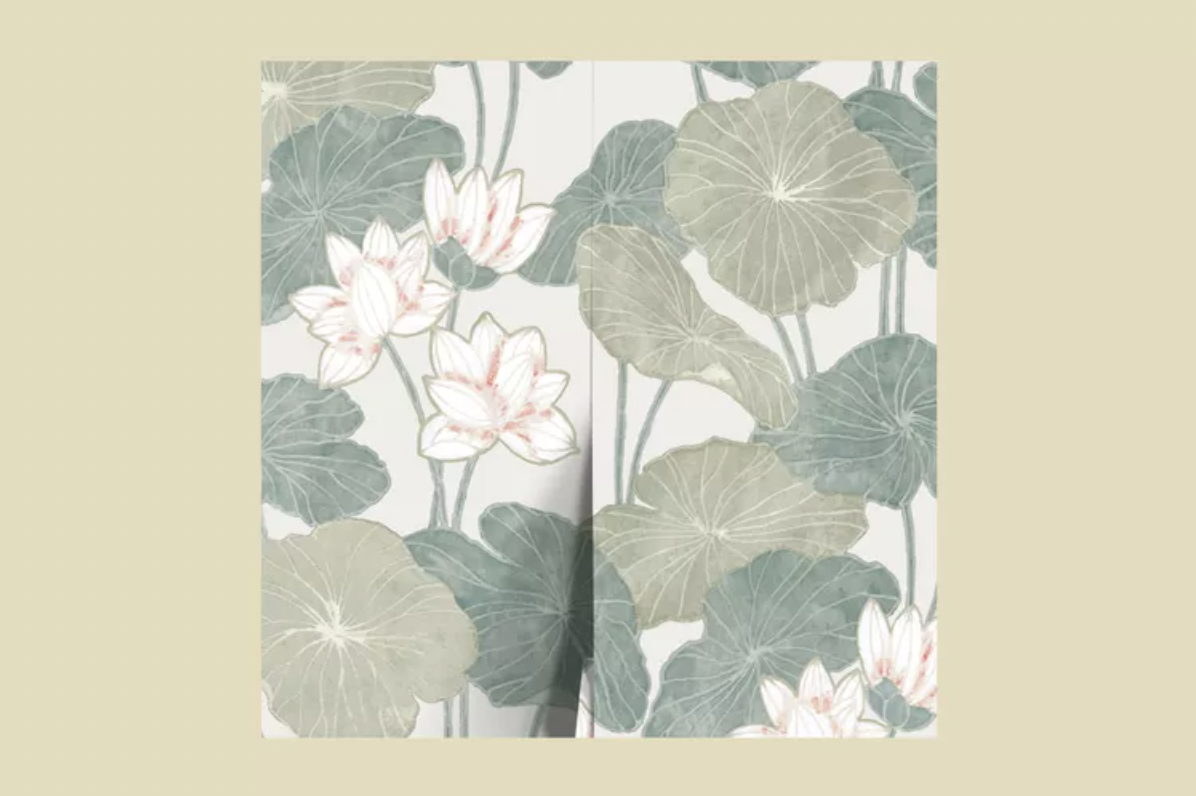
Check out #2: Lulu & Georgia Lily Pad Peel and Stick Wallpaper

Create a calming atmosphere in your home with this paper, which incorporates dynamic water lilies into its design. "Lulu & Georgia has loads of fun patterns and textures including grass cloth, faux cane, stripes, animal prints, and botanicals," says Watts. "Their patterns would work well in a kid's bedroom, hallway, entryway, kitchen, or bathroom."

Buy on Luluandgeorgia.com

Image courtesy of Lulu and Georgia

Apartment Therapy - 7 Common Rental Bathroom Eyesores and How Designers Would Fix Them

Written by Sarah Lyon Check out 7 solutions HERE!

We are on a wallpaper kick over here!
The problem:
Uneven or lackluster walls.
The solution: Install removable wallpaper.

If you aren’t much of a painter, try
temporary wallpaper to jazz up your tile or yellowed walls. “Wallpaper is another great way to spruce up a tiny bathroom,” says Watts. “As with paint color, go bold, go bright, and go big!” Being strategic with a larger-scale pattern, as Watts explains, can actually make your bathroom appear bigger in size.