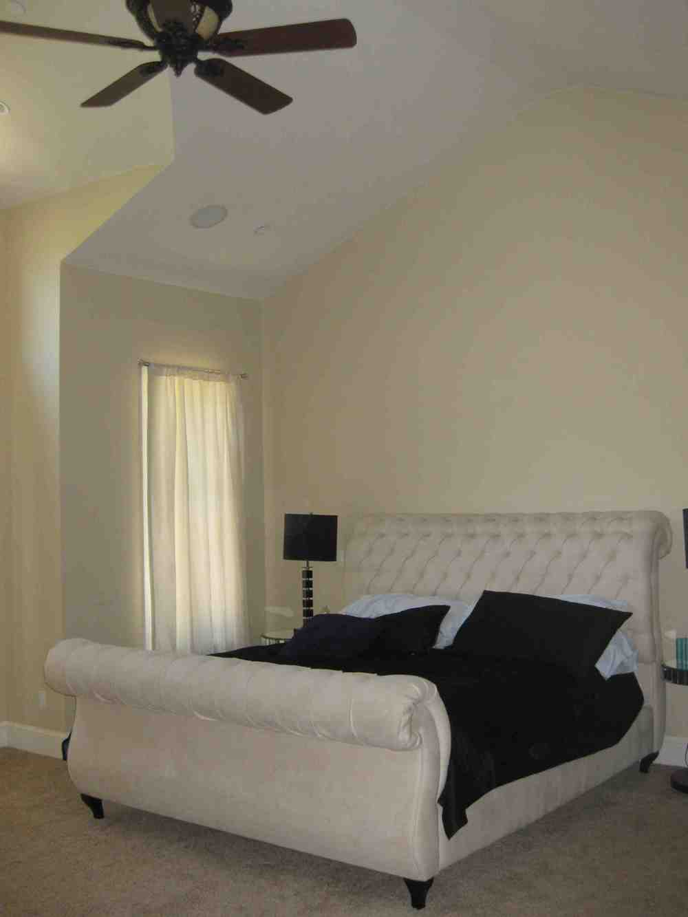
This new home needed a fresh look for the master bedroom, and we selected a few beautiful elements to make the space feel grown-up and inviting.
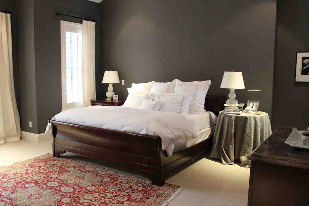
We started with the furniture plan. In this case, we were lucky: There was clearly a wall meant for the bed. Then, to make the scale of the room feel more intimate, we chose a gray-brown for the walls.
My clients had the side tables, which we covered in tone on tone seersucker. We topped the tables with my favorite small gourd lamps from Visual Comfort.
Simple white linen curtains soften the look of the windows and shutters--perfect for a bedroom. And we added a pop of color with the great rug at the foot of the bed.
We're working on adding a few more accessories and a throw. I have a few ideas. What would you choose?
BEFORE:

AFTER:

