I loved this project because we touched every inch of the house, and the master bedroom is one of my favorite spaces. We started with a blank slate, which is always a lot of fun. Here are a few tips from this project you can use to refresh your own bedroom.
Open up the doorways. We increased the width of the opening to the left of the bed because it was a very narrow space going into the now sun room.
Plan your space. When we changed the opening, we also claimed some of the space from a secondary bedroom for a sitting area and master bathroom. The space for the sitting room was originally a sleeping porch when the house was built. It was then converted into a closet, which covered the windows. Our change exposed the windows again. Cheers for natural light!
Build on one thing you love. Our inspiration was the window treatment fabric from Brunschwig & Fils. Pulling a very subtle color from a leaf in the pattern, we decided on the wall color: Benjamin Moore's Woodland White. Then we found this gorgeous Scalamandre geometric pattern in a red-cut velvet for the side chair--so divine!
Layer your bed. We used a light-aqua gingham from Schumacher on the ruffled bed skirt and an upholstery-weight Kravet fabric on the headboard, with contrast welt in the gingham. Bed linens are from Restoration Hardware. I love starting with a fabric with multiple colors so we can pull colors from it to find the next fabric or paint color.
Check back in a few weeks to see new lamps for the bedside tables! I am looking for either a dark blue or a crisp ivory glazed base.

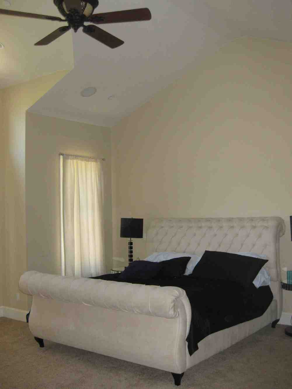
BEFORE

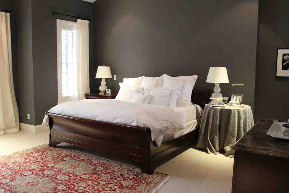
AFTER: Ahhh...