Simple = Sophisticated

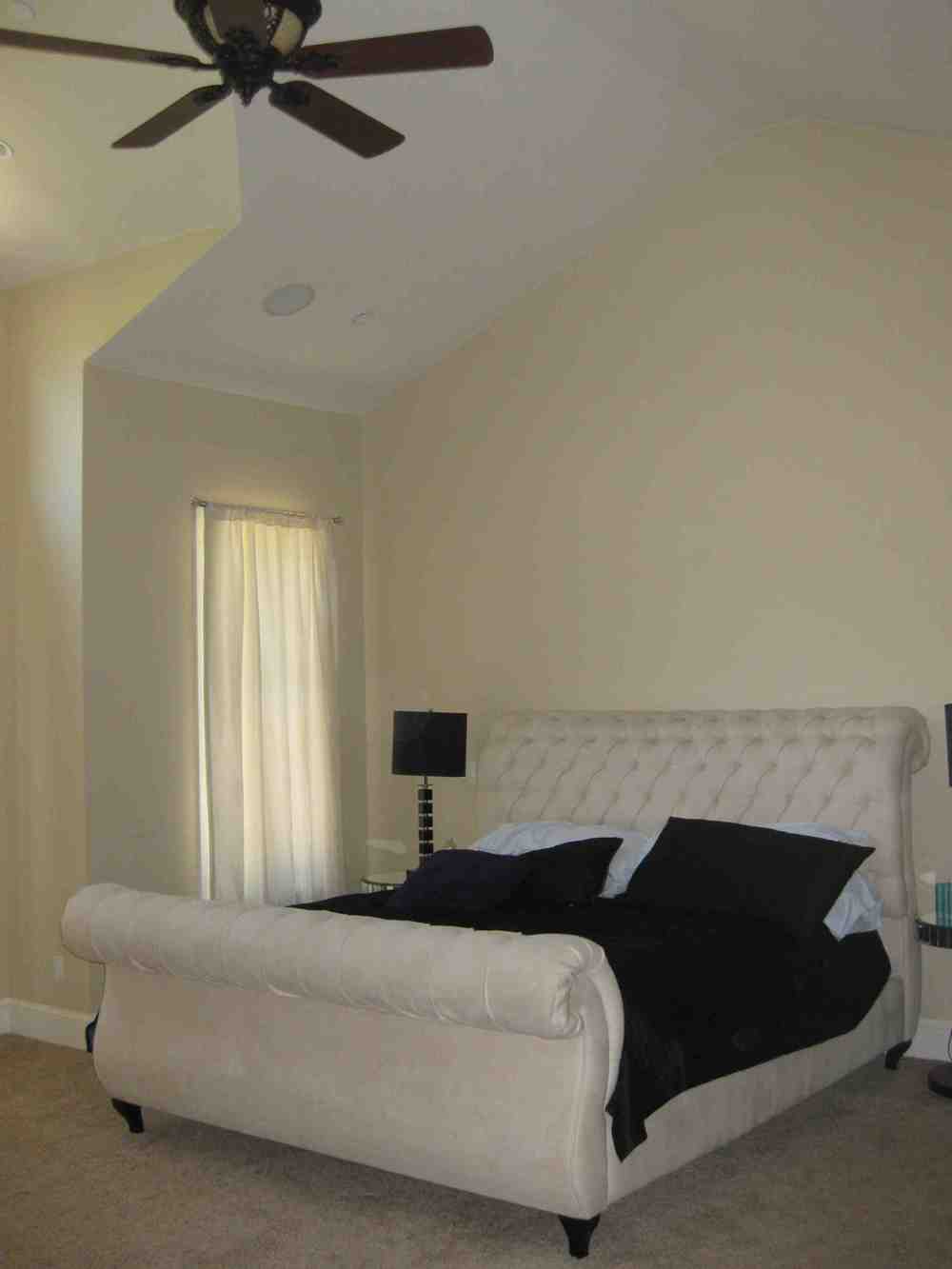
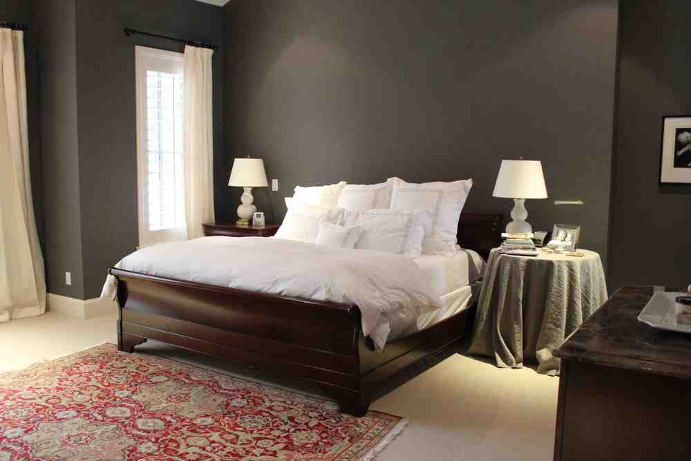
This new home needed a fresh look for the master bedroom, and we selected a few beautiful elements to make the space feel grown-up and inviting.

We started with the furniture plan. In this case, we were lucky: There was clearly a wall meant for the bed. Then, to make the scale of the room feel more intimate, we chose a gray-brown for the walls. 

My clients had the side tables, which we covered in tone on tone seersucker. We topped the tables with my favorite small gourd lamps from Visual Comfort.

Simple white linen curtains soften the look of the windows and shutters--perfect for a bedroom. And we added a pop of color with the great rug at the foot of the bed. 

We're working on adding a few more accessories and a throw. I have a few ideas. What would you choose? 

BEFORE:


AFTER:


Quick Tour: Master Bath Redo

People often ask me for a few of my favorite sources, when they get tired of looking at the same stuff from the run-of-the-mill stores. Here's a round-up of places I found the elements for this master bath remodel:

Tile: Thassos and Ming Green tile from Decorative Materials at the Denver Design Center.

Fixtures: Rohl

Vanity: Aspen Leaf

Sconces: Visual Comfort

Mirror: Horchow

Rug: Dash and Albert

Stool: Wisteria

And the cool poster over the tub of Jacqueline Kennedy's Dresses. Add a frame and ta-da!

After: Vanity


Before: Shower Area (Beautiful, right?)


After: Shower Area

Beautiful Bath


On one of Denver's prettiest historic streets, this home had four large bedrooms, so we stole one to create a master suite, complete with a pretty master bathroom. Here's the skinny:

We started with the tile and slab. We wanted slab without dark veins to have a lighter look throughout, and we found Valley Gold Vein to be the best option. TIP: Select slab a few weeks before installation to make sure you have a great selection from the slab yard because at times, the slab yard may be out of what you are looking for. On the floors, we used Calcutta Gold marble in 12-by-12-inch squares set in a diamond pattern with accents of Mosaic Black marble. Glam!

The fixtures come from Rohl and the sparkly sconces are from Waterworks. Our crowning achievement? Rosslyn paper from Farrow & Ball for the water closet. What do you think?


Family Room Furnishings + Some of My Favorite Sources

This great room-kitchen space belongs to a family with young kids, and we knew they would spend the majority of their time here. So when the time came to buy furniture, we paid close attention to how they live and how they wanted to use the space.

We started with a custom-size jute area rug from Synergy Floor Covering at the Denver Design District to create our "furniture area." Using rugs to designate intimate spaces within a large room is an easy and effective design trick. I like to start with where the furniture goes, place the coffee table and measure 18 inches to the sofa and/or chairs; this will give you plenty of room to walk around and sit down/get up. From the backs of the sofa and chairs, add about 6-12 inches (depending on how much space you have in the room) to see how large your rug should be. People tend to choose rugs that are too small, which makes the furniture feel like it is "floating" and not anchored to the floor.

Then we teamed up with a local upholsterer to design a pair of sofas, which we upholstered in fabric from Zoffany and Lee Jofa. The Zoffany fabric is an indoor/outdoor fabric made of Teflon; we wanted something that would be indestructible! The pillow fabric is the pop in the room. (Every room needs pop!) The chairs (from McGuire) are from the clients' former house.

I love the French bistro counter stools, which we chose because we knew they'd be great for a family with young children. 

The coffee table was the last element we needed. In design, some things come together really quickly, and other things take a while--and the coffee table falls into that latter category. We tried to find one "off the floor," but nothing quite worked, so we turned to a local woodworker who built this piece to the perfect proportion for the space.


BEFORE


 AFTER