Homes & Gardens - Colors Interior Designers include in Every Project

Thank you Emily Moorman and Homes & Gardens for asking us what favorite color we use in every project… any guesses? Click here for the full article!

'It’s hard to pick just one color, but if I had to, I’d go with blue,' says Denver-based designer Nadia Watts. 'When I meet with clients, they often tell me they want their home to feel calm and peaceful. When I think of calm, I picture being by the lake or at the beach, breathing in that fresh air. Blue really captures that vibe for me.'

'I also love pairing it with green – it’s all about growth and renewal, which adds a refreshing, natural touch to a space. I tend to use these colors in almost every project because they not only inspire me but also reflect the kind of atmosphere I want to create – peaceful, connected to nature, and cozy with just the right amount of freshness,' says Nadia

Photograph by Emily Minton-Redfield

Homes & Gardens - Elegant colors that will elevate any room – 6 go-to shades among designers for a timeless space

Thank you Homes & Gardens and Emily Moorman for this feature on how to elevate your interiors! Read the entire article here!

'I always find myself coming back to blues and greens when I want to create a sophisticated yet inviting space,' says Denver-based designer Nadia Watts. 'These colors are timeless – blue feels effortlessly elegant and calming, while green adds a fresh, natural element that brings life to a room.'

'To keep things interesting, I love incorporating pops of color like pink for an unexpected touch. Even in more neutral spaces, a bold accent can make all the difference. Another favorite of mine is using grasscloth wallpaper – it adds texture, depth, and just the right amount of character to make a space feel layered and refined,' says Nadia.

Photograph by Emily Minton-Redfield

Homes & Gardens - The Best 8 Teal Paints

Thank you Emily Moorman and Homes & Gardens for including one of our favorite teal colors! Check out all of the teals here.

'I’ve always been drawn to versatile hues, and Benjamin Moore’s Oasis Blue is one of those shades that just feels right every time I use it,' says Denver-based interior designer Nadia Watts. 'It’s a beautiful blend of blue and green – rich and vibrant like a gemstone, yet soft and grounded enough to feel timeless.'

'What I love most about this color is its versatility. It makes a statement without being overwhelming, bringing just the right amount of depth and personality to a space. It transforms a room, while still feeling inviting. It’s a color that works in so many ways, and I always find myself coming back to it,' says Nadia.

Photograph credit to The Shade Store

Homes & Gardens - Designers say these '80s-inspired colors are making a comeback in 2025

Thank you Emily Moorman and Homes & Gardens for including our thoughts on 80’s inspired colors in 2025!

'Neon pink was such an iconic color in the '80s – it was everywhere, from fashion and graphic design to pop culture, bringing this fun, rebellious energy that defined the era. But what’s exciting is how it's making a bold return in today’s interiors, not just as a nostalgic nod but as a fresh statement of individuality.’

Check out all the colors here!

Photograph by Sargent Photography

Homes & Gardens - What colors go best with pale blue? 7 of the most stylish pairings recommended by interior experts

Enjoy this piece by Emily Moorman on colors that go with pale blue- read here!

This is one of my favorite rooms we designed. Featuring a Vintage French light fixture from Harbinger NY, fabrics from Lee Jofa and GP &J Baker, chairs from Serena and Lily, and sconces from Visual Comfort with a cocktail table from Bunny WIlliams Home. .

Photograph by Emily Minton-Redfield.

Homes & Gardens - 9 Rooms That Prove Color Drenching Makes Smaller Spaces Look Bigger

Thank you Emily Moorman and Homes & Gardens for including me in this article on color drenching!

'Color drenching is a great way to quickly expand the feeling of a space,' says Nadia. 'In this project, we chose a custom wallcovering for the ceiling to get the color-drenching look with a unique blend of wallpaper, paint, and furniture. The sofa and rug carry the color throughout the room making it feel cohesive and elevated.'

Click here for the whole article!

Photo by Sargent Photography

Homes & Gardens - These are the 5 best paint colors to lighten a dark kitchen

Thank you Homes & Gardens and Molly Malsom for this beautiful feature on kitchens!

Do you need to lighten up your kitchen? Read HERE for 5 of the best paint colors.

'Blue is a classic color that works well with a variety of styles and finishes. Choose a light and bright neutral countertop to balance the blue. I chose a mix of materials to compliment the blue cabinetry, from chrome to antique brass, traditional to modern, the beauty of blue is that it's a classic color with traditional elements that can also span the eras of design seamlessly,' explains Nadia.

Photograph by Emily Minton-Redfield

Homes & Gardens - 5 LUXE SHADES AND HOW TO INCORPORATE THEM INTO YOUR HOME

From rich jewel tones to neutrals, these colors add a sense of luxury to home decor.

Color plays a hugely important role in setting the mood and tone of a room. Indeed, the right color choices can set you on your way to mastering a sense of luxury, no matter what decorating style you favor.

Thank you Homes and Gardens and Emily Moorman for featuring our Jeweled Gallery from this year’s Kips Bay Decorator Show House in West Palm Beach, FL!

Read the article HERE

(Image credit: Susan Yeley Homes/photography Sarah Shields, Nadia Watts Interior Design/photography Nickolas Sargent, Hanna Li Interiors/photography Jess Isaac/styling Kate Flynn)

House Beautiful - Is 3D Design the Way of the Future?

Thank you House Beautiful and Kelly Allen for including us in this 3D design feature using All3D: a company that creates shockingly realistic renderings. To put their tech to the test, we asked five interior designers—Serena Dugan, Heather Peterson, Kiyonda Powell, Nadia Watts, and Anita Yokota—to reimagine the same bedroom in different ways.

See all five designers here!

Image by All3D

House Beautiful: What inspired your design?

Nadia Watts: Flora and fauna! Biophilia was top of mind for this project as I was in the midst of joining the committee for Luncheon By Design in Denver, featuring this amazing biophilia exhibit at the Denver Art Museum. I live in Colorado and nature has always been an inspiration. The idea of being intertwined with the natural world speaks to me. It’s the perfect starting point for design inspiration.

HB: Which pattern did you start with?

NW: The Porter Teleo wallcovering and the window coverings in The Gem Collection, which I created with Kravet, are where it all began. I fell in love with the large-scale pattern on the paper and then went with contrasting stripes on the ceiling by Sanderson and zig-zags on the draperies by Kravet. The biophilia shines in the paper. The geometric stripes and zig-zags perfectly complement the nature-inspired wallcovering.

HB: Describe the room you designed in three words.

NW: Whimsical, comfortable, and unique.

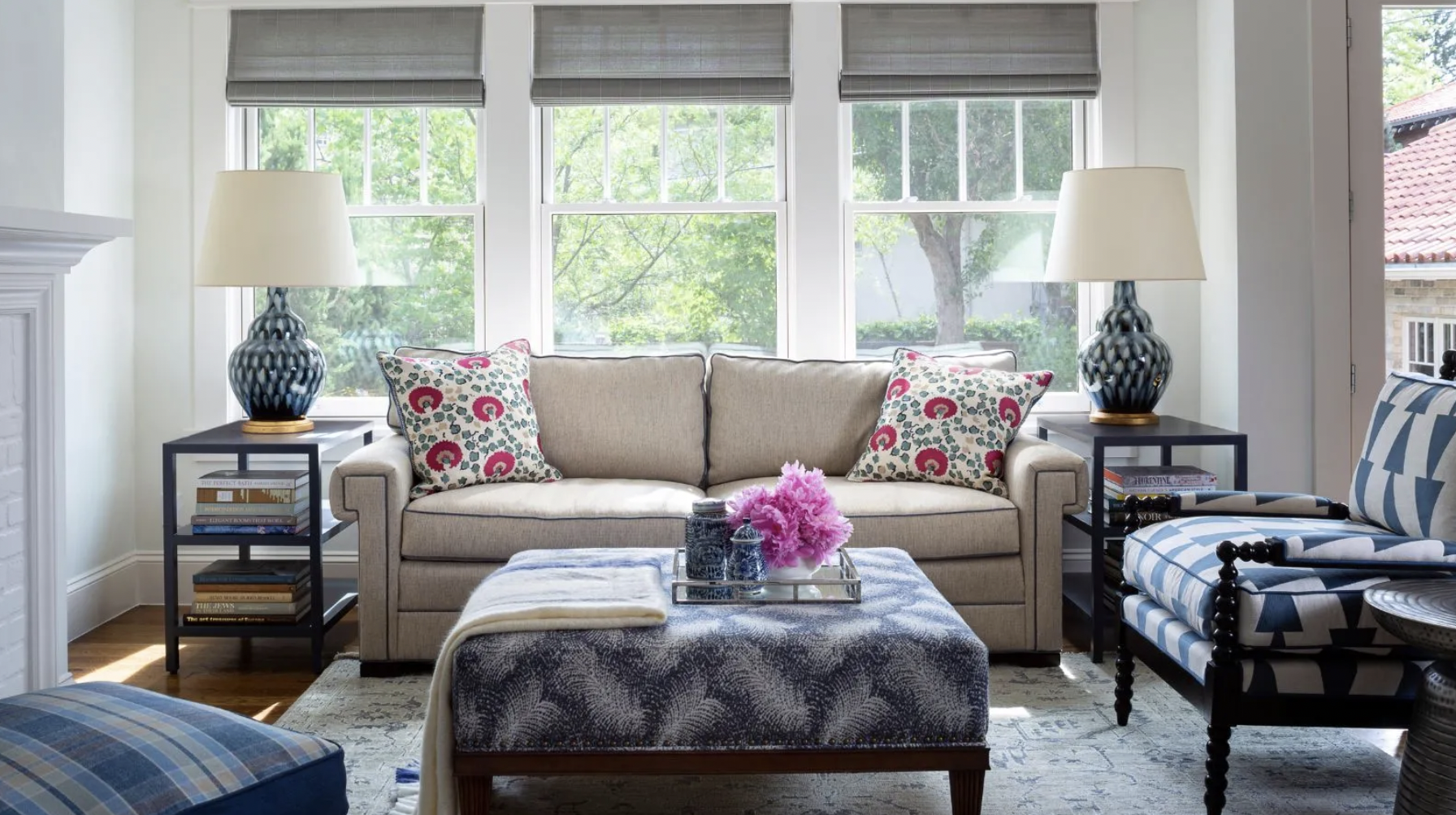
HB: What do you like most about the pattern-on-pattern trend?

NW: Pattern-on pattern forces you out of your comfort zone, and the results are always unique. It’s such an active and curious way to design a room. The “let’s try it and see” approach is so much fun. The pattern-on-pattern trend opens up so many possibilities. It broadens the creative process, which is always a treat.

HB: Can you share any tips for designing around this trend and choosing complementary patterns/colors?

NW: This trend thrives under an analogous color scheme. Choosing colors from the same family will help your patterns feel purposeful and curated. So choose a palette and stick to it. Your room will thank you for it. I like to use a mix of natural, free-flowing patterns with more structured geometric patterns. Also, keep scale in mind. You want to vary your scale with an assortment of small, medium, and large-scale prints.

HB: What role do you think technology like this will play in the future of design?

NW: This has been a huge year for technology in the design world. Having a tool that allows you to show your design concepts in such a tangible way is a game changer. Technology is making design more accessible for people, allowing them to see a space as the creative vision comes together.

Homes & Gardens - These are interior designer's favorite tried-and-tested Farrow & Ball paint colors

Written by Emily Moorman

Farrow & Ball Mizzle and Down Pipe

Teaming up Farrow & Ball's Mizzle and Down Pipe is a failsafe color combination for Denver-based interior designer Nadia Watts. In the kitchen shown above, Nadia used Mizzle as the main color choice across the kitchen cabinet ideas, adding contrast with Down Pipe for the kitchen island ideas

'It's hard to choose just one favorite from Farrow & Ball,' she begins. 'I love the combination of Mizzle and Down Pipe. These in-between colors are almost like a neutral, they work well with so many other colors and patterns. Mizzle is a soft gray-green reminiscent of a misty drizzle, hence the name. The gray undertones work well with Down Pipe, which also has gray undertones. Down Pipe has a deep blue hue which brings complexity and richness. These two colors work great for cabinetry as well as walls. Because they are in between colors, they play well with others and will withstand trends.'

To read all the favorites HERE