I am so excited to share this Homeworthy House Tour of my home with you! Click Here to Watch

Homes & Gardens - Elegant colors that will elevate any room – 6 go-to shades among designers for a timeless space →
Thank you Homes & Gardens and Emily Moorman for this feature on how to elevate your interiors! Read the entire article here!
'I always find myself coming back to blues and greens when I want to create a sophisticated yet inviting space,' says Denver-based designer Nadia Watts. 'These colors are timeless – blue feels effortlessly elegant and calming, while green adds a fresh, natural element that brings life to a room.'
'To keep things interesting, I love incorporating pops of color like pink for an unexpected touch. Even in more neutral spaces, a bold accent can make all the difference. Another favorite of mine is using grasscloth wallpaper – it adds texture, depth, and just the right amount of character to make a space feel layered and refined,' says Nadia.
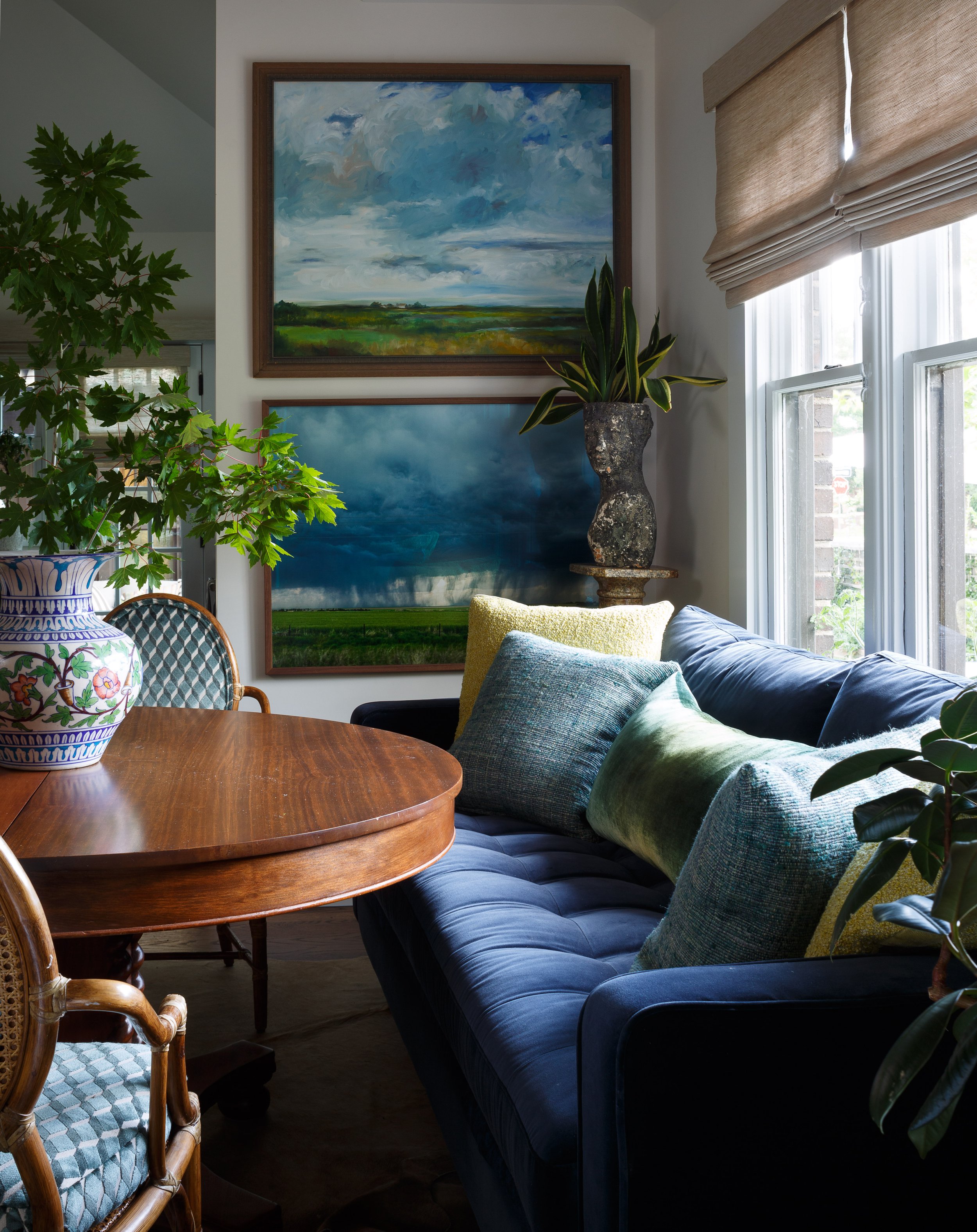
Photograph by Emily Minton-Redfield

Homes & Gardens - The Best 8 Teal Paints →
Thank you Emily Moorman and Homes & Gardens for including one of our favorite teal colors! Check out all of the teals here.
'I’ve always been drawn to versatile hues, and Benjamin Moore’s Oasis Blue is one of those shades that just feels right every time I use it,' says Denver-based interior designer Nadia Watts. 'It’s a beautiful blend of blue and green – rich and vibrant like a gemstone, yet soft and grounded enough to feel timeless.'
'What I love most about this color is its versatility. It makes a statement without being overwhelming, bringing just the right amount of depth and personality to a space. It transforms a room, while still feeling inviting. It’s a color that works in so many ways, and I always find myself coming back to it,' says Nadia.
Photograph credit to The Shade Store

Homes & Gardens - What colors go best with pale blue? 7 of the most stylish pairings recommended by interior experts →
Enjoy this piece by Emily Moorman on colors that go with pale blue- read here!
This is one of my favorite rooms we designed. Featuring a Vintage French light fixture from Harbinger NY, fabrics from Lee Jofa and GP &J Baker, chairs from Serena and Lily, and sconces from Visual Comfort with a cocktail table from Bunny WIlliams Home. .
Photograph by Emily Minton-Redfield.

Homes & Gardens - Designers are championing 'in-between' colors for 2025 – it's all about a nuanced, non-traditional approach to color →
Thank you Emily Moorman and Homes & Gardens for including our thoughts on in-between colors- one of my favorite topics! Read about all the in-between colors here.
Photograph of Kips Bay Decorator Showhouse Palm Beach 2024
Homes & Gardens - Designers who never follow trends swear by this color family to make their homes look timeless →
Thank you Homes & Gardens and Emily Moorman for including me in this article on timeless color schemes!
Denver-based interior designer Nadia Watts also associates blue with timeless design, also favoring decorating with Benjamin Moore's Hale Navy: 'Hale Navy is a workhorse color, suitable for all types of rooms, walls, and ceilings. Navy goes with everything – it works really well as a neutral because it complements so many colors.'
The entire article is here!
Photography by David Patterson

Homes & Gardens - Is White or Cream more on trend for 2025? Which of these enduring neutrals are designers favoring (and where and when to use them) →
Thank you, Homes & Gardens and Emily Moorman, for including me in your article on 2025's trending neutrals!
'A crisp white paint is ideal for ceilings and trim and also works well for kitchen cabinets. Choose a white with a touch of cream for more warmth and depth. I love Benjamin Moore's White Dove and Cloud White. White is great for making neutrals pop and works well with gray, whereas cream pairs well with color,' explains Denver-based designer interior designer Nadia Watts.
Read the entire article here.
Photograph by Emily Minton-Redfield

Homes & Gardens - 5 colors to decorate with in July 2024 according to designers, for a summery feel inside the home →
5 colors to decorate with in July 2024 according to designers, for a summery feel inside the home
Written by Emily Moorman
Check out Number 3 Sunset Colors….. Click Here for All Trends!

Image from Homes & Gardens
'When I think summer I think in reds, yellows, pinks, and oranges,' says interior designer Nadia Watts. 'Bright, saturated colors that remind me of the sunset over the lake; warm tones that evoke long summer days.'
For Nadia, summer color inspiration comes from the slower pace of life during these months, turning to nature and reflecting this indoors through vibrant, warm hues that feel uplifting.
'July brings a sense of freedom: school's out, work slows and family comes together. I am inspired by the slower pace of summer, it reminds me to take a moment to step back and appreciate the natural world around us. Pulling colors from nature has always been a special source for me, and what better time to do that than in the height of summer.'

Image by David Patterson
Homes & Gardens - Summer color trends for 2024 – 10 sunny shades interior designers can't get enough of →
Summer Color Trends for 2024 – 10 sunny shades interior designers can't get enough of
Written by Emily Moorman
Check out Number 4 Celestial and Metallic Colors….. Click Here for All Trends!

Image from Homes & Gardens
'Celestial and metallic colors are in for summer,' observes interior designer Nadia Watts. 'Using metallics and striking colors is a great way to add dimensions and excitement to your space without having to redesign your entire space.'
'When you incorporate bold color, you can use it sparingly and still get a big “wow” factor. Already have a blue color story? Add a pop of metallic cobalt. Starting with a green scheme? Bring in a celestial citrine.'
'Layering color on color in different finishes creates depth and interest and elevates your color story throughout.'
Homes & Gardens - Designers say these are 5 of the most difficult paint colors to decorate with – here's how to make them work →
Designers say these are 5 of the most difficult paint colors to decorate with – here's how to make them work Written by Emily Moorman
What Are The Most Difficult Paint Colors To Decorate With? Check out All Five HERE
Dark Jewel Colors
“Decorating with jewel tones often seems like a bold move, but if sophisticated and dramatic is the goal, these dark tones are a winner.”

Photographer: Nickolas Sargent