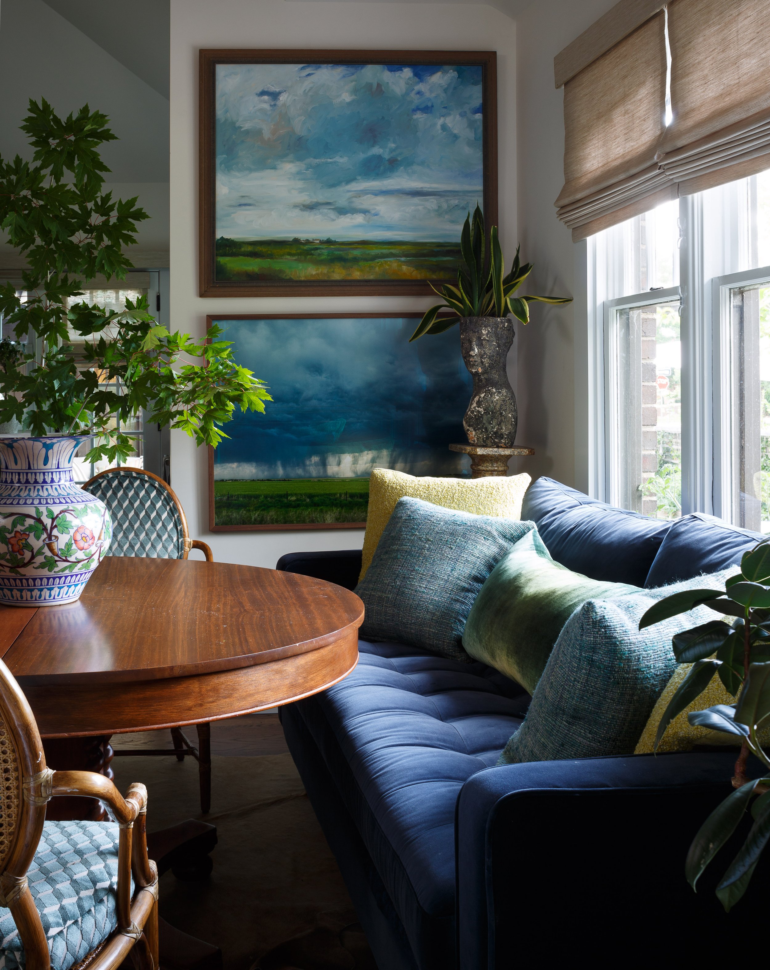
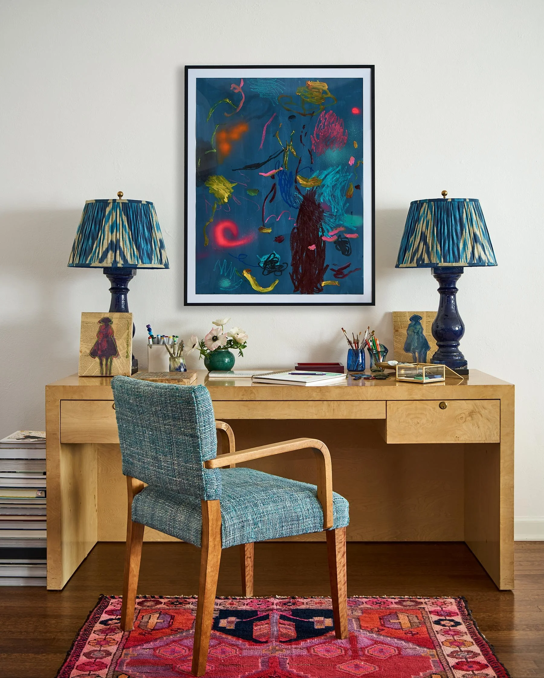
I am so excited to share this Homeworthy House Tour of my home with you! Click Here to Watch
Martha Stewart - 5 Paint Colors to Never Use in Your Living Room, According to Interior Designer →
Thank you to Martha Stewart and Blythe Copeland for this feature—I’m so excited to share my insights on creating warm, inviting spaces with your wonderful readers!
“You absorb energy from your room, and color matters,” she says. “There are many colors other than gray that work as a neutral base. These will bring energy, vibrancy, and warmth to your living room. Think creamy beige, warm blues and greens, caramel-y browns, or rich jewel tones.”
Skip cool white in favor of a neutral with depth and personality. “If you want that ‘gallery’ look and love all-white walls, then be sure you choose a white with warm undertones,” says Watts. “Whites with gray or blue undertones will make your space feel stark. Instead, look for a neutral with some cream or beige that feels warm and welcoming.”
Photograph by Emily Minton-Redfield.
Read the full article by Blythe Copeland here.
Better Homes & Gardens - Are Formal Living Rooms Obsolete? Not According to Top Design Experts →
Thank you, Better Homes & Gardens, for showcasing us in this feature about how to design a space where life happens!
"Having an entire room in your home dedicated to guests and formal seating just doesn’t make sense for most people anymore. Flexibility and efficiency is what’s current—rooms that have double and even triple uses." —Nadia Watts
Read Here for the full article written by Colleen Sullivan
Photograph by David Patterson
Luxe Magazine - In Living Color →
Tips For Infusing Color In Your Interiors With Nadia Watts
Thank you for a beautiful piece written by Laura Beausire and Kelly Badal
Photographs by David Patterson
Click here for the link to the tips!
Homes & Gardens - 5 colors to decorate with in July 2024 according to designers, for a summery feel inside the home →
5 colors to decorate with in July 2024 according to designers, for a summery feel inside the home
Written by Emily Moorman
Check out Number 3 Sunset Colors….. Click Here for All Trends!
'When I think summer I think in reds, yellows, pinks, and oranges,' says interior designer Nadia Watts. 'Bright, saturated colors that remind me of the sunset over the lake; warm tones that evoke long summer days.'
For Nadia, summer color inspiration comes from the slower pace of life during these months, turning to nature and reflecting this indoors through vibrant, warm hues that feel uplifting.
'July brings a sense of freedom: school's out, work slows and family comes together. I am inspired by the slower pace of summer, it reminds me to take a moment to step back and appreciate the natural world around us. Pulling colors from nature has always been a special source for me, and what better time to do that than in the height of summer.'
Image by David Patterson
Homes & Gardens - Summer color trends for 2024 – 10 sunny shades interior designers can't get enough of →
Summer Color Trends for 2024 – 10 sunny shades interior designers can't get enough of
Written by Emily Moorman
Check out Number 4 Celestial and Metallic Colors….. Click Here for All Trends!
'Celestial and metallic colors are in for summer,' observes interior designer Nadia Watts. 'Using metallics and striking colors is a great way to add dimensions and excitement to your space without having to redesign your entire space.'
'When you incorporate bold color, you can use it sparingly and still get a big “wow” factor. Already have a blue color story? Add a pop of metallic cobalt. Starting with a green scheme? Bring in a celestial citrine.'
'Layering color on color in different finishes creates depth and interest and elevates your color story throughout.'
LivingEtc - These 15 Modern Desks Have Been Handpicked by a Shopping Editor — They're Beautiful, but Practical Too →
A modern desk is a mainstay of the modern home office. Written by Brigid Kennedy, who walks you through the selection process before sharing a few of her current favorites.
Thank you LivingEtc and Brigid for taking the time to discuss my thoughts on all things desks!
Read the full article HERE where I share my perspective on how to incorporate a design-forward, and functional office desk.
Photographer: David Patterson of my desk at home
Living Etc - ...how designers create decor that feels "naturally cooling" →
Written by OONAGH TURNER
Check out this interesting article From colder colors to the right layout, this is how designers create decor that feels "naturally cooling"
You will read 5 Ideas for cooling your rooms!
Photographer: Emily Minton-Redfield
The Wall Street Journal - Designers Who Are Practically Family →
Ecstatic to be featured in the Mansion Section of The Wall Street Journal
Written by Jessica Flint and Photography by Cary Jobe
Click HERE to see the article
AD 9 Living Room Design Ideas Designers Swear By →
Architectural Digest AD It Yourself
9 Living Room Design Ideas Designers Swear By By Perri Ormont Blumberg
Move Wall Art…
“Rotate your art as if you’re in a gallery. You’ll be amazed at the difference a simple tweak can make. Changing the location of your art can dictate a novel approach to transforming the rest of your living room space.”
To read the full article and other 8 Design Ideas Click Here


