Homes & Garden - Outdated kitchen color trends – Five Colors to Avoid in 2025, and What to use Instead

Thank you to Homes & Garden for featuring me in this insightful piece on five colors to avoid in 2025.

Cool-Tones Grey- This color trend is commonly associated with ultra-modern finishes, which can also be seen by some as outdated for 2025. 'Industrial kitchens with loads of gray, metal, and commercial finishes are a thing of the past,' adds interior designer Nadia Watts. 'The starkness just doesn’t feel homey or comfortable. People want their kitchen to feel lived in, to feel comfortable, and like it’s the heart of the home. It’s hard to create a cozy kitchen destination with shiny hard sleek surfaces at every turn.'

Read the full article written by Jennifer Ebert here!

Homes & Gardens - 5 colors to decorate with in July 2024 according to designers, for a summery feel inside the home

5 colors to decorate with in July 2024 according to designers, for a summery feel inside the home

Written by Emily Moorman

Check out Number 3 Sunset Colors….. Click Here for All Trends!

Image from Homes & Gardens

'When I think summer I think in reds, yellows, pinks, and oranges,' says interior designer Nadia Watts. 'Bright, saturated colors that remind me of the sunset over the lake; warm tones that evoke long summer days.'

For Nadia, summer color inspiration comes from the slower pace of life during these months, turning to nature and reflecting this indoors through vibrant, warm hues that feel uplifting.

'July brings a sense of freedom: school's out, work slows and family comes together. I am inspired by the slower pace of summer, it reminds me to take a moment to step back and appreciate the natural world around us. Pulling colors from nature has always been a special source for me, and what better time to do that than in the height of summer.'

Image by David Patterson

Homes & Gardens - Summer color trends for 2024 – 10 sunny shades interior designers can't get enough of

Summer Color Trends for 2024 – 10 sunny shades interior designers can't get enough of

Written by Emily Moorman

Check out Number 4 Celestial and Metallic Colors….. Click Here for All Trends!

Image from Homes & Gardens

'Celestial and metallic colors are in for summer,' observes interior designer Nadia Watts. 'Using metallics and striking colors is a great way to add dimensions and excitement to your space without having to redesign your entire space.'

'When you incorporate bold color, you can use it sparingly and still get a big “wow” factor. Already have a blue color story? Add a pop of metallic cobalt. Starting with a green scheme? Bring in a celestial citrine.'

'Layering color on color in different finishes creates depth and interest and elevates your color story throughout.'

Homes & Gardens - Designers say these are 5 of the most difficult paint colors to decorate with – here's how to make them work

Designers say these are 5 of the most difficult paint colors to decorate with – here's how to make them work Written by Emily Moorman


What Are The Most Difficult Paint Colors To Decorate With? Check out All Five HERE

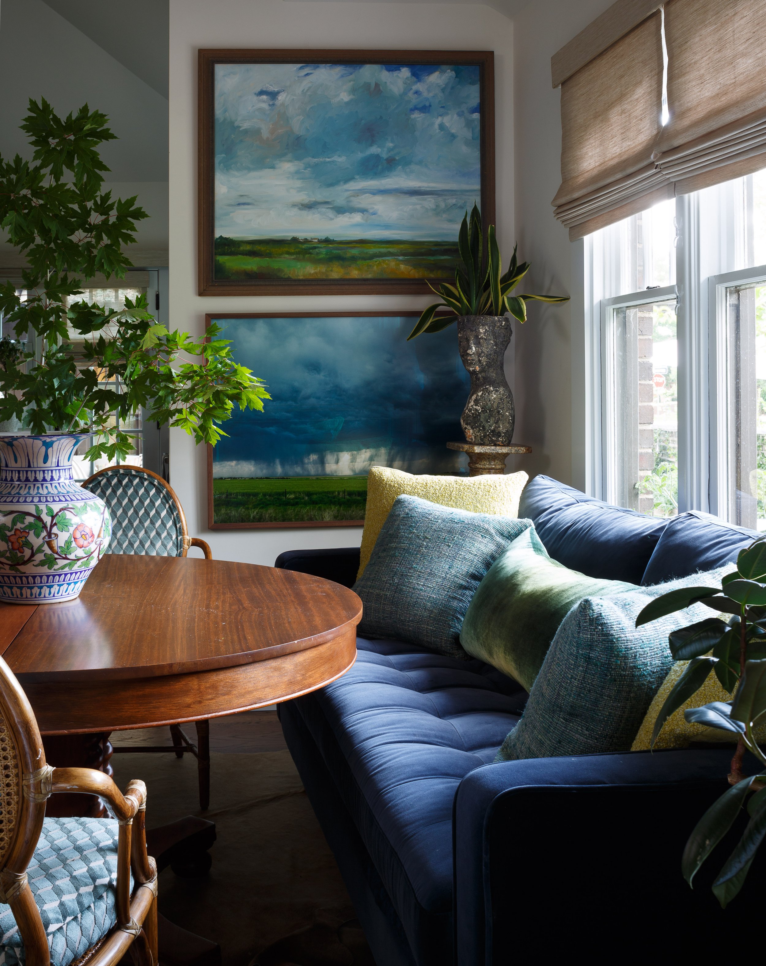
Dark Jewel Colors

Decorating with jewel tones often seems like a bold move, but if sophisticated and dramatic is the goal, these dark tones are a winner.”

Photographer: Nickolas Sargent

Washington Post - Warm up to a more colorful home with these tips written

Warm up to a more colorful home with these tips written by Sarah Lyon

I shared with Sarah my approach for selecting paint colors:

“Say you are done with gray and ready for a change,” Watts says. “Gray typically has a cool undertone, so start looking at blues that have a little bit of green in them. You can always go lighter or darker on the spectrum, depending on how dramatic you want your room.”

Click here for more tips and to read the full article