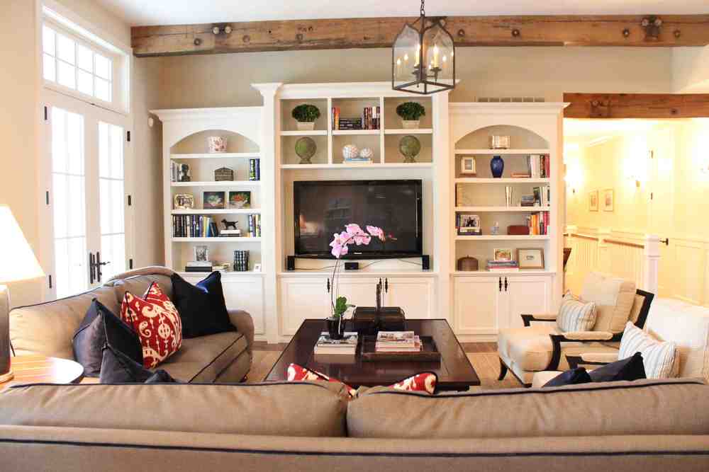
Ecstatic to be featured in the Mansion Section of The Wall Street Journal
Written by Jessica Flint and Photography by Cary Jobe
Click HERE to see the article
Ecstatic to be featured in the Mansion Section of The Wall Street Journal
Written by Jessica Flint and Photography by Cary Jobe
Click HERE to see the article
Bookshelves are an ideal place to show off your style, to showcase things you love and reveal your personality in subtle ways. But lots of homeowners admit that they have a hard time figuring out how to make their bookshelves look magazine-worthy.
I have good news: It's easier than you think! I've gathered a few photos and my best advice to help you get started. Have fun!

From HGTV: For timeless style, group similar books together and add decorative objects (like those eagle bookends and the rotary phone) that feel classic. The library ladder is a perfect touch, don't you think?

From Design Lines: One simpe tip is to stack some books horizontally, and top some of these stacks with interesting objects. Easy-peasy, right?

From Primed4Design: Small pieces of framed art on your bookshelves give your room warmth and interest. The collection here feels so well curated: textureal, quirky, beautiful. I love it!

From Primed4Design: Group your books by color and display them with colorful accessories. So fun!

From Homesick Designs: All right, I admit that this took more than simple styling. But I love that the piece integrates bookshelves and an entertainment system- a perfect solution to the black-box-on-the-wall problem with flat-screened TVs. You might also take a cue from this room and add round objects to your bookshelves; the curves help break up the linear look of books.

From Sawdust Girl: Who says you have to put books on your bookshelves? There are very few tomes on this shelf, and it looks awesome with sculptural items and framed pictures.
If you have bookshelves you've styled and you want to show them off, send them to me at nadia@nadiawatts.com, and I'll put them in an upcoming post- with a link to your website or blog, if you have one!
Happy Styling!
A bit of good news: You don't have to revamp a whole room to add visual interest to your space. One of my favorite design tricks is to change up the backs of bookshelves with a bold paint color. Take a look at these spaces:

BEFORE: These are handsome bookshelves, but they don't exactly serve as a strong design element in the room. And I bet you couldn't care less what's on those shelves because you can't actually see what's on them.

AFTER: I used dark navy paint, Benjamin Moore Hale Navy, to draw a viewer's eye in and give enough contrast to make the obects on the shelves interesting.
And here's another example:

BEFORE: Lovely but a bit dull.

AFTER: We used a finishing technique by a local finisher, using a base coat of Benjamin Moore, Chili Pepper, and a glaze applied with a tint of Rasberry Pudding. The living room in this house is long; painting the backs of the bookshelves helps the human eye find an easy and interesting place to rest.