Pretty Powder Room

Often clients ask me to make their spaces do more--help small rooms appear bigger, improve the "flow" of a room, maximize closet space--but in this case, the client had a full bathroom where she only wanted a powder room. 

We began by figuring out the proper size and style for the vanity. Standard height is about 34-36 inches for counters right now. (It always seems to be changing and I hope soon it won't be taller than me!) We placed the toilet with plenty of room around it, and then looked at the space left over. We came in from the opposite wall about 12-14 inches to give the space a sense of airiness. We wanted a traditional vanity and polished nickel fixtures because it fits perfectly with the rest of her house.

Then we found the Bianco Antico countertop at Decorative Materials at the Denver Design District. If you live somewhere with a design center, it's absolutely worth your time to walk through the showrooms before you get too far into your project. Most showrooms will sell only to the trade (meaning designers, architects, and builders), but you can get great ideas. Plus, designer centers can often pair homeowners with designers who will help make the purchases and shape up the design!

We pulled a color from the slab to select the paint- Benjamin Moore Aegean Teal for the vanity. We wanted wallpaper from the start and finally settled on The Ringwold Papers from Farrow and Ball. (Their stuff is so delicious, I could just eat it!) And the sconces--jewelry for any bathroom--are from the client's previous home. Voila!


BEFORE: Down to the studs


 AFTER: A good-looking, traditional powder room with just the right amount of sparkle.


Family Room Furnishings + Some of My Favorite Sources

This great room-kitchen space belongs to a family with young kids, and we knew they would spend the majority of their time here. So when the time came to buy furniture, we paid close attention to how they live and how they wanted to use the space.

We started with a custom-size jute area rug from Synergy Floor Covering at the Denver Design District to create our "furniture area." Using rugs to designate intimate spaces within a large room is an easy and effective design trick. I like to start with where the furniture goes, place the coffee table and measure 18 inches to the sofa and/or chairs; this will give you plenty of room to walk around and sit down/get up. From the backs of the sofa and chairs, add about 6-12 inches (depending on how much space you have in the room) to see how large your rug should be. People tend to choose rugs that are too small, which makes the furniture feel like it is "floating" and not anchored to the floor.

Then we teamed up with a local upholsterer to design a pair of sofas, which we upholstered in fabric from Zoffany and Lee Jofa. The Zoffany fabric is an indoor/outdoor fabric made of Teflon; we wanted something that would be indestructible! The pillow fabric is the pop in the room. (Every room needs pop!) The chairs (from McGuire) are from the clients' former house.

I love the French bistro counter stools, which we chose because we knew they'd be great for a family with young children. 

The coffee table was the last element we needed. In design, some things come together really quickly, and other things take a while--and the coffee table falls into that latter category. We tried to find one "off the floor," but nothing quite worked, so we turned to a local woodworker who built this piece to the perfect proportion for the space.


BEFORE


 AFTER


Bookshelf Redux

A bit of good news: You don't have to revamp a whole room to add visual interest to your space. One of my favorite design tricks is to change up the backs of bookshelves with a bold paint color. Take a look at these spaces:


BEFORE: These are handsome bookshelves, but they don't exactly serve as a strong design element in the room. And I bet you couldn't care less what's on those shelves because you can't actually see what's on them.

AFTER: I used dark navy paint, Benjamin Moore Hale Navy, to draw a viewer's eye in and give enough contrast to make the obects on the shelves interesting.


And here's another example:


BEFORE: Lovely but a bit dull.

 AFTER: We used a finishing technique by a local finisher, using a base coat of Benjamin Moore, Chili Pepper, and a glaze applied with a tint of Rasberry Pudding.  The living room in this house is long; painting the backs of the bookshelves helps the human eye find an easy and interesting place to rest.


Get Cozy: Master Bedroom Redo

People often ask designers where to start when they're remodeling or redesigning a room. Sometimes I use a piece of art or a fabric that a client loves, but in the case of this master bedroom, we started with the soft powder blue walls. Blue tends to be a calming color, so a bedroom is the perfect place to use it!

With the help of a local upholsterer, we selected a classic shape for the headboard and then had it covered in two fabrics from Calvin, one for the main body and one for the contrast piping. (TIP: Contrast piping is a great way to add a little interest and tailoring to an upholstered piece. I love it!) 

Custom pieces are the perfect way to get exactly what you want (and they're not as expensive as you might assume). But the challenge is that you and your designer have to decide all of the details. In this case, we thought long and hard about how high to make the headboard. We had plenty of ceiling height and could do just about anything we wanted. The headboard is 66 inches from the floor, a little higher than I normally do them, to move your eye up the bed and be a little more dramatic!

We found great-looking sidetables from Restoration Hardware that followed the classic look, and polished it off with clean ivory-glazed lamps from Visual Comfort. The clients found the rug on a trip to Santa Fe--it was the perfect piece to the design puzzle!


BEFORE: BOR-ing!


AFTER!!!

Design Secret: How to Fix a Big, Blank Wall

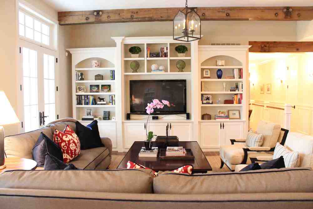
Before my clients moved into their new home, I snapped these photos of the family room. The wall where the TV hung was so stark and needed much more interest.

The solution? A built-in, which holds the TV, books, photos, accessories, and media equipment. By using a similar finish to the finish on the nearby kitchen cabinets (the kitchen and family room are actually one big space), we made the built-ins feel like they have been there all along! 

We used a carpenter provided by our contractor. If you're looking for a great finisher in your area, ask around: A furniture store that has high-quality pieces you really like should always have a few recommendations.

Notice the cabinets below the windows. We're in the process of changing those slightly to fit more with the built-ins. Stay in touch to see the new lower cabinets in the next few weeks! 


Inspiration Objects

Beginning a room's design with a piece of art or object you love is a great source of inspiration. I've found that many clients have a treasured piece they want to be sure to include. As a designer I try to take inspiration from those special pieces. Finding fabrics or furniture that falls in line with what they already like is a sure win.

In this room, the client owned an antique Suzani and a pair of antique Argentinean chairs that she wanted to incorporate into the home.  We used a local upholsterer to center the design on the seat and back of the chairs. We made a contrast welt choosing one of the colors from the Suzani.


Here the client owned a piece of art from a local denver artist, Duke Beardsley . http://www.dukebeardsleystudio.com/  We included darker piece of furniture to balance the art work and move ones eye around the room. 

-Nadia