Martha Stewart - 5 Paint Colors to Never Use in Your Living Room, According to Interior Designer

Thank you to Martha Stewart and Blythe Copeland for this feature—I’m so excited to share my insights on creating warm, inviting spaces with your wonderful readers!

“You absorb energy from your room, and color matters,” she says. “There are many colors other than gray that work as a neutral base. These will bring energy, vibrancy, and warmth to your living room. Think creamy beige, warm blues and greens, caramel-y browns, or rich jewel tones.”

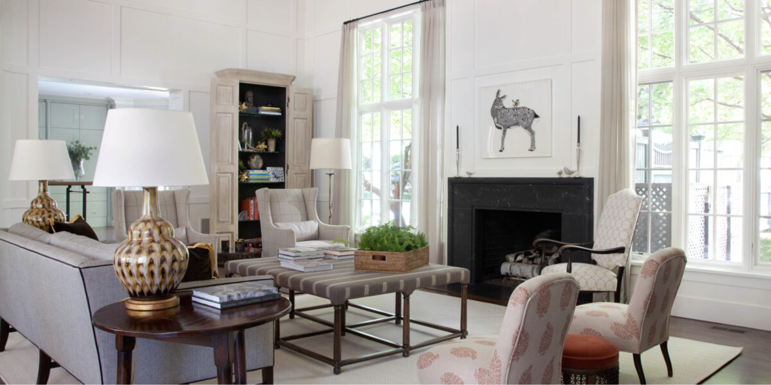
Skip cool white in favor of a neutral with depth and personality. “If you want that ‘gallery’ look and love all-white walls, then be sure you choose a white with warm undertones,” says Watts. “Whites with gray or blue undertones will make your space feel stark. Instead, look for a neutral with some cream or beige that feels warm and welcoming.”

Photograph by Emily Minton-Redfield.

Read the full article by Blythe Copeland here.

Business of Home - Designer Debate 'Rules of Engagement'

Thank you to Kaitlin Petersen and Business of Home for an incredible Designer Debate alongside one of my favorite designers and dear friend, Joe Ireland. It was an honor to be part of this conversation!

Great design is best achieved over time. When communication channels are wide open, both the client and designer have a better understanding of the project overall.

Gradually designing the room results in a curated feel with history and a sense of narrative. The outcome feels purposeful and soulful like it was all meant to be.

Photograph by Emily Minton-Redfield

The story will be published in the Fall 2024 issue of BOH magazine and is also available online for subscribers and BOH Insiders here.

House Beautiful - 7 Things People Over 30 Should Have in Their Home, According to Designers

Thank you to House Beautiful and Shelby Deering for featuring us—I’m so grateful to share my passion for creating beautiful spaces!

Decor can become more meaningful in our 30s and beyond. “Perhaps it's an antique from a relative or photographs from your favorite vacations,” Watts says. “In your 30s, you feel yourself choosing items that spark good memories and feelings versus utilitarian things that serve a basic purpose.”

Photograph by David Patterson

Read the entire article here.

Homes & Gardens - Barbara Palvin's front porch is a masterclass in this Southern European trend – its historical roots are anything but dated

Thank you, Homes & Gardens, for including our design to emulate the Spanish Revival trend.

The contrast between the cool tones of the blue and the warmth of the traditional materials creates a dynamic and engaging space that feels both timeless and playful.

Read the full article here!

Photograph by Emily Minton-Redfield

Better Homes & Gardens - What are the best color combinations for fall? 7 cozy-season-ready suggestions from designer

Thank you to Better Homes & Gardens for featuring our yellow and wood tones!

'I am drawn towards warm yellows and oranges in the fall,' says designer Nadia Watts. 'It’s a transitional season and yellows and oranges help bridge the gap between the brights of summer and the cool tones of winter.’

Photo by Emily Minton-Redfield

Read the full article by Emily Moorman here for some cozy, fall color combinations.

Homes & Garden - Outdated kitchen color trends – Five Colors to Avoid in 2025, and What to use Instead

Thank you to Homes & Garden for featuring me in this insightful piece on five colors to avoid in 2025.

Cool-Tones Grey- This color trend is commonly associated with ultra-modern finishes, which can also be seen by some as outdated for 2025. 'Industrial kitchens with loads of gray, metal, and commercial finishes are a thing of the past,' adds interior designer Nadia Watts. 'The starkness just doesn’t feel homey or comfortable. People want their kitchen to feel lived in, to feel comfortable, and like it’s the heart of the home. It’s hard to create a cozy kitchen destination with shiny hard sleek surfaces at every turn.'

Read the full article written by Jennifer Ebert here!

Better Homes & Gardens - Are Formal Living Rooms Obsolete? Not According to Top Design Experts

Thank you, Better Homes & Gardens, for showcasing us in this feature about how to design a space where life happens!

"Having an entire room in your home dedicated to guests and formal seating just doesn’t make sense for most people anymore. Flexibility and efficiency is what’s current—rooms that have double and even triple uses." —Nadia Watts

Read Here for the full article written by Colleen Sullivan

Photograph by David Patterson

Sunset - Designers Say These Are the Easiest Tweaks You Can Make to Upgrade Your Home

Thank you, Sunset and Kelsey Mulvey, for sharing our tips on elevating your surroundings! Click Here to Read!

Looking for a bright idea? - Consider sprucing up your home’s lighting. “Layer in lighting and swap out outdated light fixtures,” recommends Denver-based designer Nadia Watts.

Photograph by Emily Milton-Redfield

Better Homes & Gardens - 25 Designer-Approved Ideas for Modernizing a Gallery Wall

Thank you Better Homes & Gardens and Colleen Sullivan, for including us in 25 Designer-Approved Ideas for Modernizing a Gallery Wall

Mix Art with Metals - Mixing materials is one way to achieve a modern effect when it comes to a gallery wall. “I love to hang whimsical metal sculptures alongside colorful abstract paintings to create balance and structure. The result is a fun-filled wall that feels fresh and purposeful,” says Nadia Watts, the owner of Nadia Watts Interior Design.

Click HERE to Read

In the Kips Bay Palm Beach Show House 2024, we partnered with Singulart to select artists from around the world for our space. This gallery wall features a large scale painting by Gary Kormain and three metal sculptures by Jose Soler.

Photographer: Nick Sargent