Homes & Gardens - These are interior designer's favorite tried-and-tested Farrow & Ball paint colors

Written by Emily Moorman

Farrow & Ball Mizzle and Down Pipe

Teaming up Farrow & Ball's Mizzle and Down Pipe is a failsafe color combination for Denver-based interior designer Nadia Watts. In the kitchen shown above, Nadia used Mizzle as the main color choice across the kitchen cabinet ideas, adding contrast with Down Pipe for the kitchen island ideas

'It's hard to choose just one favorite from Farrow & Ball,' she begins. 'I love the combination of Mizzle and Down Pipe. These in-between colors are almost like a neutral, they work well with so many other colors and patterns. Mizzle is a soft gray-green reminiscent of a misty drizzle, hence the name. The gray undertones work well with Down Pipe, which also has gray undertones. Down Pipe has a deep blue hue which brings complexity and richness. These two colors work great for cabinetry as well as walls. Because they are in between colors, they play well with others and will withstand trends.'

To read all the favorites HERE

House Beautiful- All the Best Design Takeaways From the 2024 Kips Bay Palm Beach Show House

Thank you House Beautiful and Catherine Dipersico for this lovely piece on the Kips Bay Palm Beach Show House! Read Here for all of the Takeaways.

The designers gave new life to the classic pink-and-green palette, seashell motifs, and more.

Washington Post - Warm up to a more colorful home with these tips written

Warm up to a more colorful home with these tips written by Sarah Lyon

I shared with Sarah my approach for selecting paint colors:

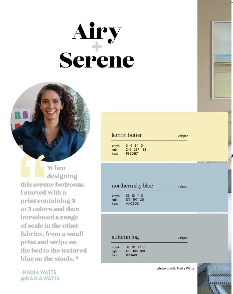
“Say you are done with gray and ready for a change,” Watts says. “Gray typically has a cool undertone, so start looking at blues that have a little bit of green in them. You can always go lighter or darker on the spectrum, depending on how dramatic you want your room.”

Click here for more tips and to read the full article


THE ZOE REPORT - How To Dip Into Color, If It’s Just Not Your Thing

THE ZOE REPORT

Written by Nicole Kliest

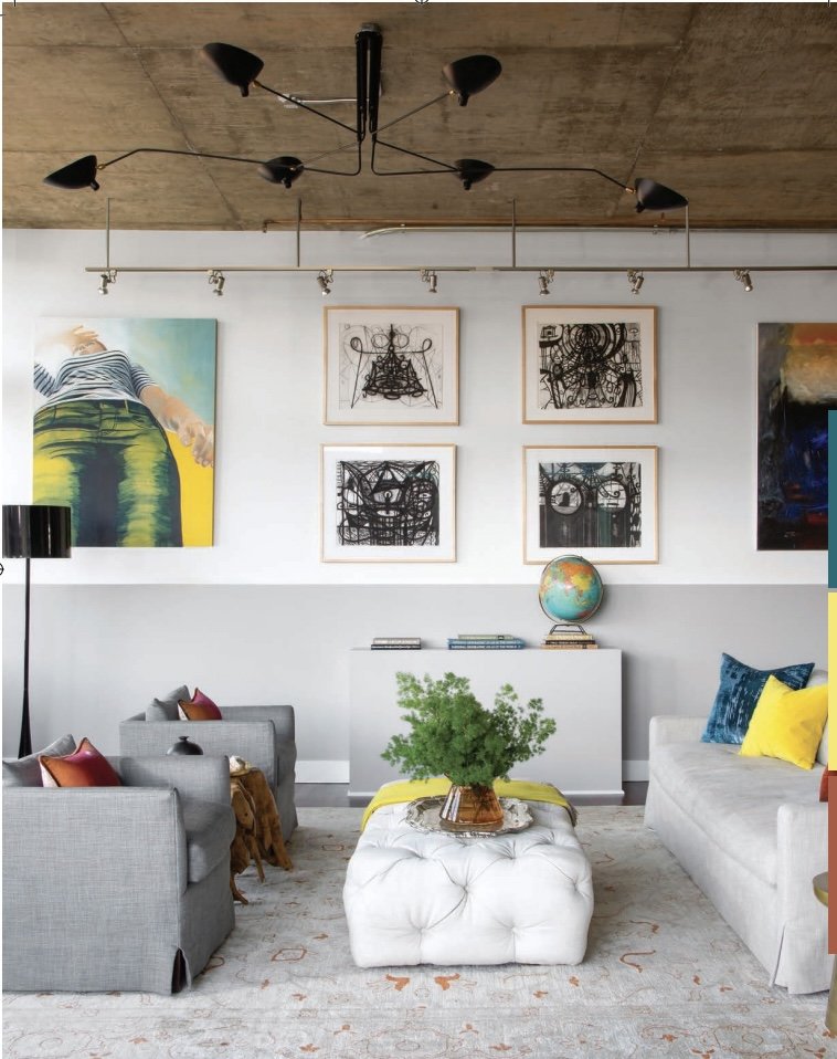
Interior designer Nadia Watts also nods toward this non-permanent approach to color. “I suggest starting with pillows and accent lighting; pillows are a great way to add a pop of color in your room without having to commit to a fully upholstered piece of furniture and an accent lamp with color can feel like a big step,” she says. “Remember that you can always move the lamp to different rooms and change the lamp shade.”

For more tips click here for the full article!

AD - The Most Underrated Paint Colors, According to 20 Designers

Architectural Digest

The Most Underrated Paint Colors, According to 20 Designers Written by Sarah Lyon

American Cheese and Nacho Cheese by Benjamin Moore

“Two warm colors I use that are underrated are Benjamin Moore American Cheese and Nacho Cheese. These are in the middle of the color deck, and at first glance seem to have a fair amount of white, but don’t be fooled by this. Once they are up on the walls they are cheerful and a breath of fresh air.” —Nadia Watts

CHECK OUT ALL THE UNDERRATED PAINT COLORS HERE